Interactive Table – Scottish Design Galleries
V&A Dundee
-

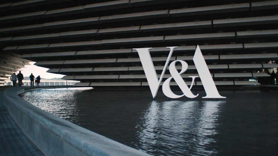
The striking Kengo Kuma designed V&A museum sits on a £1billion transformation of the Dundee waterfront.
It’s the first V&A museum outside of London in the UK and will be a centre for international design, featuring over 300 objects from their own collection as well as permanent galleries of Scottish Design, exploring Scotland’s design landscape historically and today.
-
Design Unwrapped
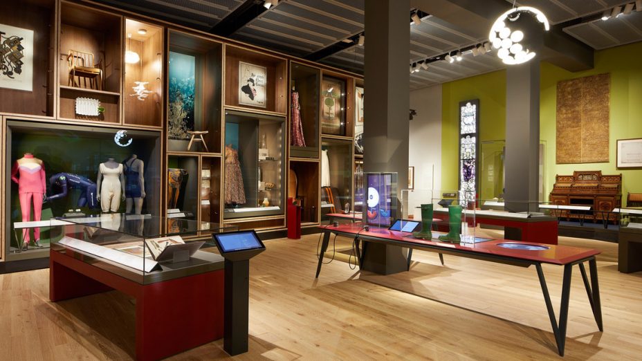
Design Unwrapped explores the design processes of four key Scottish designers and products. We illustrate their design influences, production methods, and cultural impact via a series of individual interactive exhibits presented on a large table.
Key to the development was an exploration of how physical design objects and digital media could be combined. -
Statement Phase Necklace
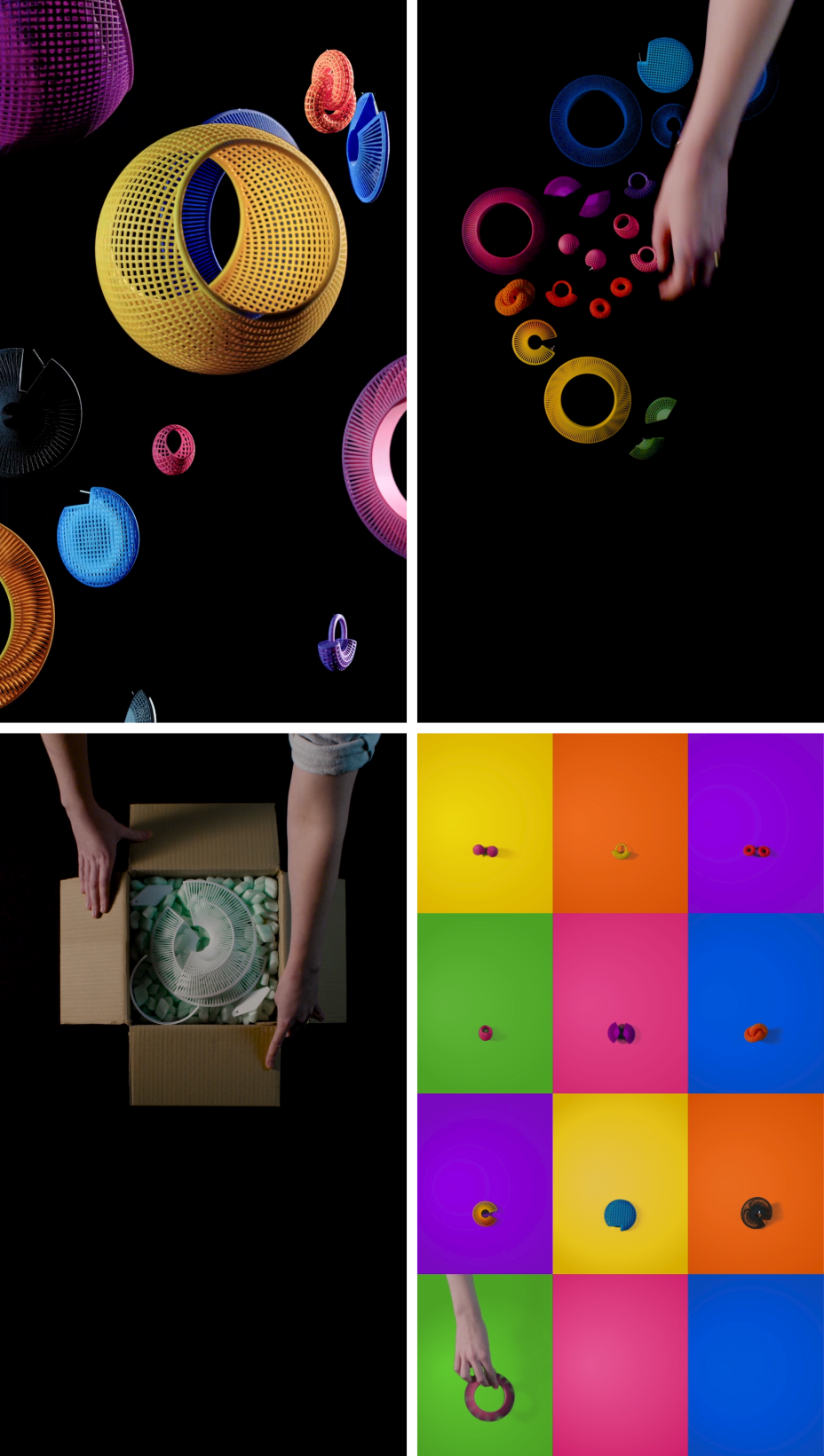
Lynne MacLachlan combines hi tech production tools such as computer modelling and 3D printing with traditional hand-dyeing techniques to create beautiful contemporary jewellery.
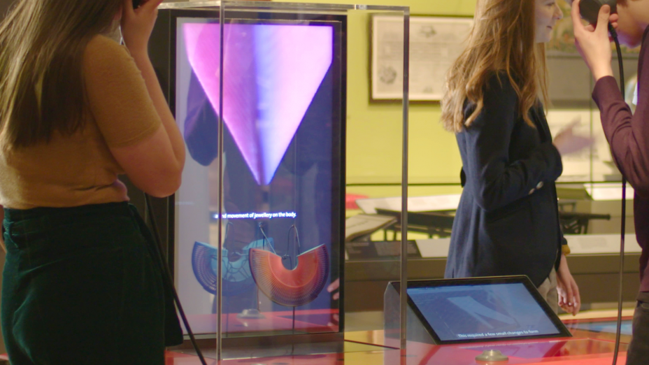
The Statement Phase necklace is presented and spotlit in a mirrored display case as per a high-end jewellery store. Sensors are embedded in the table which, when triggered, reveal animated graphics through the half-silvered mirror display.
The effect allows us to deliver an augmented layer of video and graphics around the physical object. We created a stylised film narrated by Lynne, where we follow her process as she assembles the necklace. We mixed live action with bespoke animation that illustrates the distinctive moiré effect that Lynne’s jewellery creates when in motion. -
-
Scopas Light
Scottish designer Neil Poulton designs high end products for many of Europe’s leading manufacturers including Italian lighting specialists, Artemide.
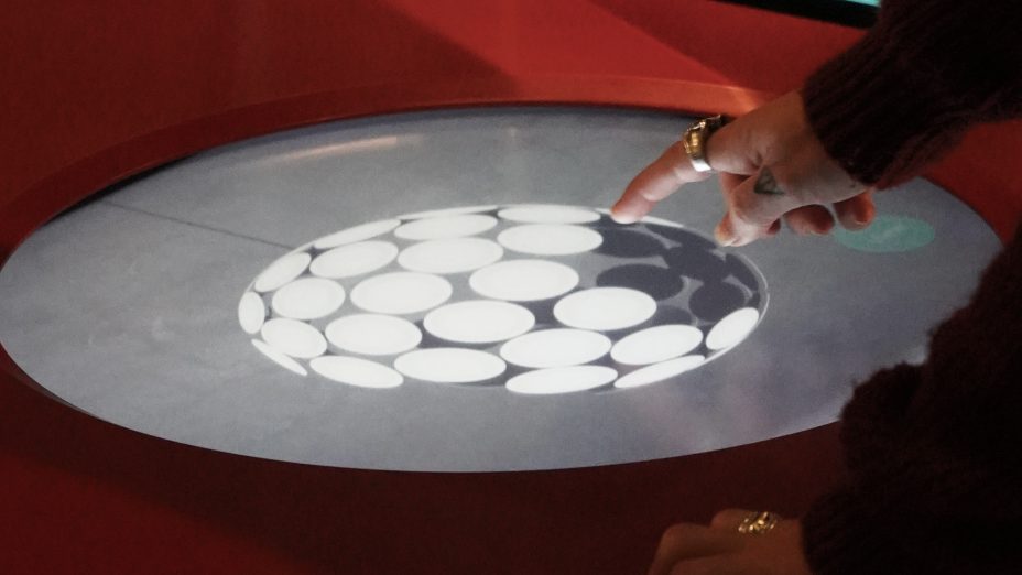
The Scopas Light uses a series of circular low energy LED discs to create a large incomplete sphere. Neil took inspiration from the Death Star and the broken mirrorball from an LCD Soundsystem album cover. He worked closely with Artemide engineers to create this innovative lighting format.
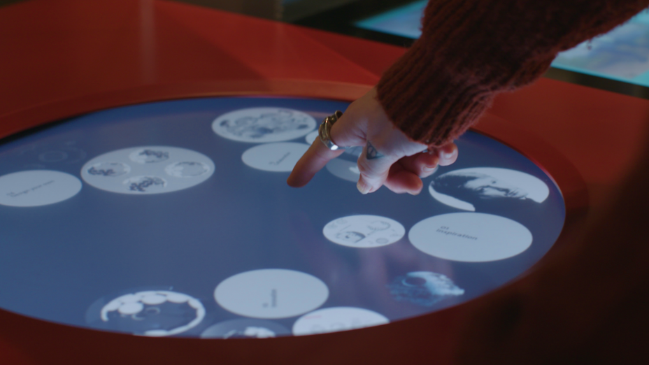
We created a 3D circular interface that mirrors the form of Scopas light. The touchscreen creates a fluid interface where discs continually re-organise and act as mini light boxes to tell his story in a series of chapters, from inspiration and early sketches to technical drawings and 3D production models. Visitors also get the opportunity to design their own version of Scopas, closely echoing Neil’s own process. -
-
The Original Hunter Boots
Hunter is one of the Scotland’s most iconic brands. The Original Hunter boots were designed and manufactured in Scotland employing an innovative use of materials and production methods that completely revolutionised the manufacture of footwear.
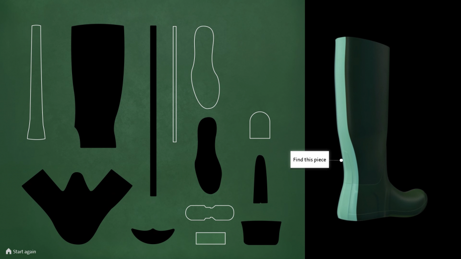
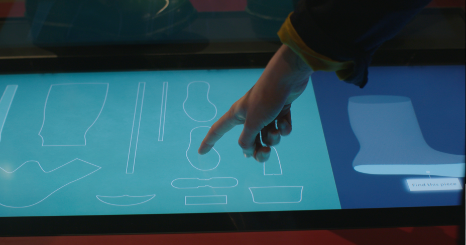
Thirteen components make up a single boot. The visitor is presented with a digital cutting table, showing all the parts which they begin to assemble. Each pattern piece reveals archive imagery from Hunter’s history highlighting use of materials, manufacture, social context and brand development. As the user selects the materials a 3D boot is gradually built up following the actual assembly process.
This exhibit explains how design took this once utilitarian object to a highly desirable global brand. -
-
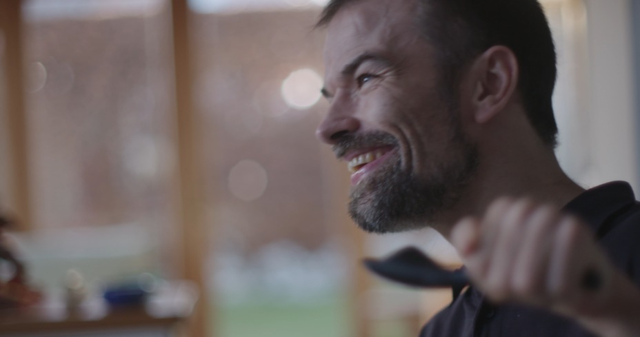
S'up Spoon
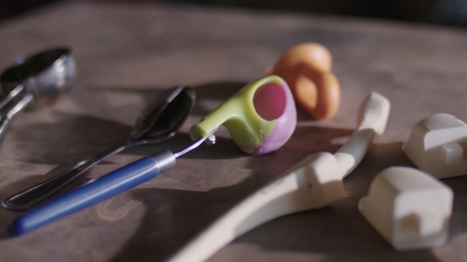
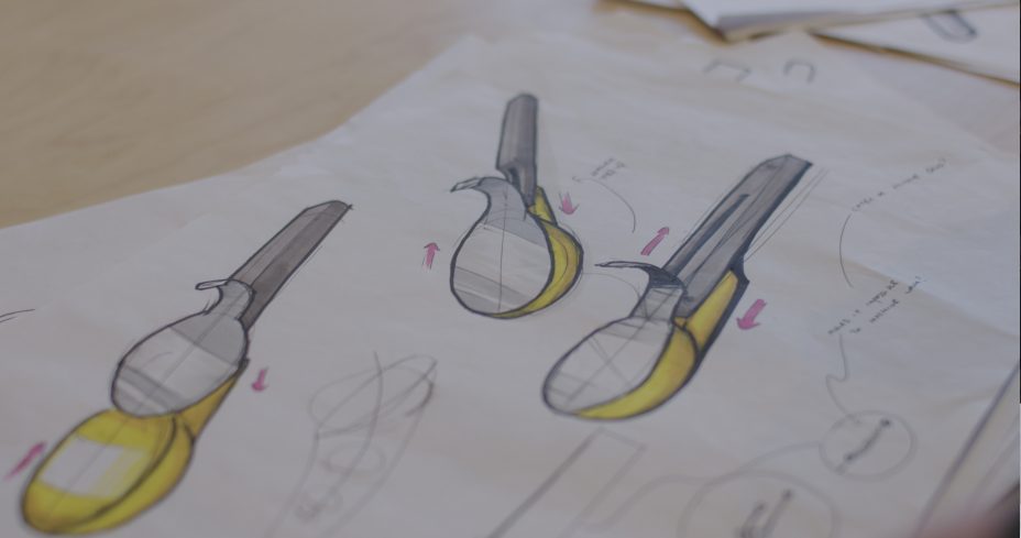
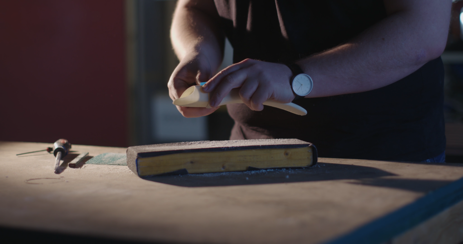
S’up Spoon is a mass produced eating utensil designed by Glasgow based 4C product designers in conjunction with Grant Douglas. It's a classic example of human centred design where the solution is defined by the specific needs of the user.
Our film is housed alongside the physical prototypes, it highlights the personal collaborations between designer and individual client that allowed the design to evolve and become a mass produced product that could help others. -
-
-
-
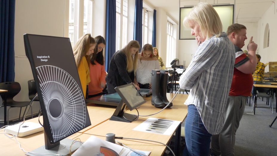
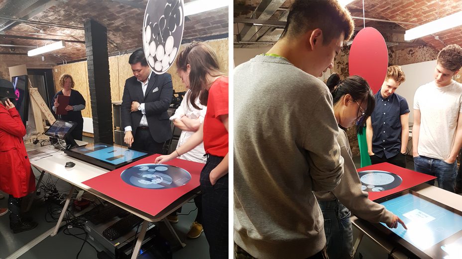
At key stages of development we conducted user testing workshops with invited groups of testers.
-
Prototyping and User Testing
An integral part of the development process was a series of user workshops, where we brought in different audience groups to work with early prototypes at key stages of development and help shape the narratives and interaction. Our aim was to deliver a distinctly different experience for each object.
The V&A curators and our designers gained a valuable understanding from these sessions helping us optimise our media and software to the user requirements. -
